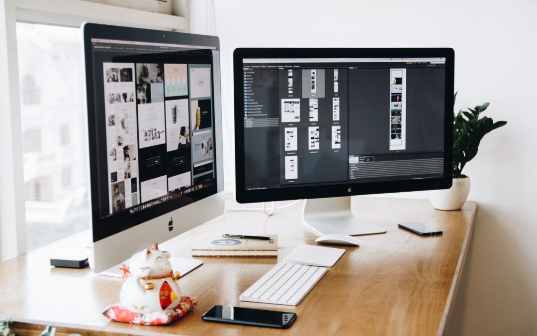
What Is Responsive Web Design?
Responsive web design takes into consideration the screen size and visual orientation of a website. It is a platform that automatically adjusts to fit on any screen size including a desktop, laptop, tablet and smartphone. It some ways you need to develop the site for those 4 unique screen sizes. In all, responsive web design is a simple concept to understand, but realistically developing a site that looks great on all 4 major screen types can be challenging.
How Do I Know If a Site Is Responsive?
Have your ever pulled up a website on your Android or iPhone and it was just a very tiny rendering of the desktop version? You probably needed to zoom in and out, swiping the scroll bar to the left and right to try to read text or see an image. That site was not responsive.
Growing Trend of Mobile Web Traffic
The reason why this is important for your business is the growing trend of mobile user traffic on websites. Nearly 60% of website traffic is comes from mobile devices, which includes tablets and smartphones. And this percentage is expected to grow each year. Here’s the bottom line, if you’re not providing a truly mobile friendly experience for your current and prospective customers, your company is at a major disadvantage.
Google Survey Results
In a survey conducted by Google, 72% of mobile users said it is important that sites they visit be mobile friendly. If they find a website to be frustrating to navigate, they will quickly leave that site for another that is mobile friendly. This represents a lost opportunity for those businesses with standard sites.
SEO Benefits of Responsive Web Design
Speaking of Google and other top search engines, they prefer responsive websites since their spiders find these types of sites easier to crawl. The benefits are increased SEO and enhanced search rankings, which means more potential customers finding your website.
Before deciding if having a responsive website is right for your business, please note that a great looking and highly functional responsive website takes careful planning from the very start. Once again, in some ways, the responsive site is designed 4 times, each for a desktop, laptop, tablet and smartphone. What is essential in this process is keeping the user experience central to every decision that will be made.
Hiring A Company To Design Your NEW Website
There are hundreds if not thousands of layout and coding options available today. Just remember that all of your decisions will have an impact on the end user. It’s important to keep that user experience in mind at all times. If you are going to hire a company to design your company’s new site or redesign your existing one, make sure they are experienced in developing responsive websites.
Having a responsive website was once considered a luxury. Now it is essential, with long term implications for your business or organization.


